Last month I took a four-day workshop with a wonderful painter and teacher, Michael Reardon.
I thoroughly enjoyed watching him demonstrate painting techniques, then trying them out myself.
Here are my big takeaways from that workshop:
Ask yourself what's important, and eliminate all else.
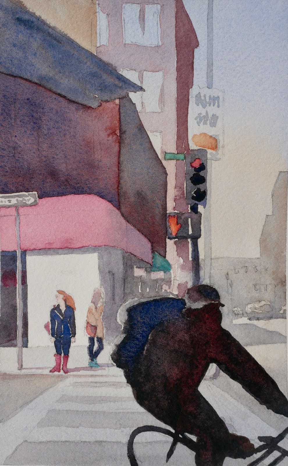
In this photo, I was interested in the woman waiting at the corner.
Things in the background and foreground should be merely suggested.
I decided to eliminate the details in the background and the bicyclist in the foreground, so that the focus could be on the woman.
Don't show the whole thing; leave something to the viewer's imagination, and the painting will be more engaging. A painting is a short story, not a novel. A poem, not an essay.
Simplify the composition, connecting shapes and shadows.
Do a value study to determine pattern of darks and lights for a pleasing composition. He showed us how to do a quick sepia study.
This study came together very quickly, because I didn't have to worry about colors or layers. I got to work out what details to eliminate, and where to add shadow shapes on the street.
I'm pleased with the background shapes, the suggested windows and signs, and the bicyclist shape. A few more details on the woman should make her stand out more.
A light underpainting, saving just a few whites, ties everything together.
I thoroughly enjoyed watching him demonstrate painting techniques, then trying them out myself.
 |
| Michael Reardon |
 |
| San Francisco street scene photo |
In this photo, I was interested in the woman waiting at the corner.
Things in the background and foreground should be merely suggested.
I decided to eliminate the details in the background and the bicyclist in the foreground, so that the focus could be on the woman.
Don't show the whole thing; leave something to the viewer's imagination, and the painting will be more engaging. A painting is a short story, not a novel. A poem, not an essay.
 |
| Sepia Study |
Do a value study to determine pattern of darks and lights for a pleasing composition. He showed us how to do a quick sepia study.
This study came together very quickly, because I didn't have to worry about colors or layers. I got to work out what details to eliminate, and where to add shadow shapes on the street.
 |
| Do Not Cross |
 |
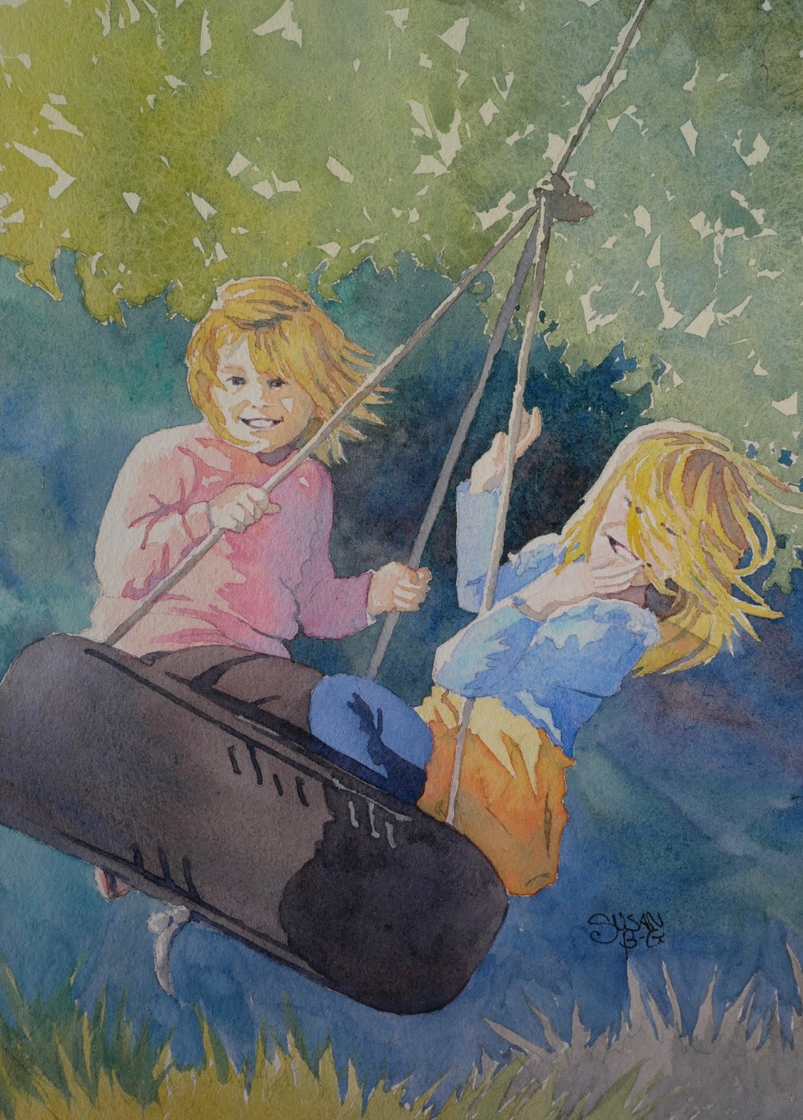
| Underpainting for Carefree Cousins |
This first layer is very light, using two or three of the same colors I'll use in the rest of the painting. I left whites where I wanted the most contrast.
This was my second color version of this painting of my granddaughters, and it was accepted into my first juried show!
A palette with single pigment colors helps avoid mud.
Therefore we should avoid convenience colors, or at least be aware of what pigments we are using.
 So I'm looking at my watercolor paint collection (which grows each time I take a workshop that suggests a different palette!) with new eyes.
 Green Gold was a recent purchase which I've used a lot. But I've noticed some unwanted, unpredictable effects on my paintings at times.
 No wonder! It contains three different pigments: PY 150, PY 3, and PG 36. Those pigments may not jive well with the other colors in a painting, especially if there are other convenience colors such as Shadow Violet or Sap Green.
Limiting the number of pigments in a painting helps keep the colors harmonious.

 These two could be better choices. This Azo Yellow contains just PY 151, and this Winsor Green just PG 36. Easier to manage the color mixing, then. Better yet, I could mix my own green with a single yellow and a blue (single pigments, of course).
Now I want to go back to old paintings I've done, and try them again using this new knowledge!
Happy painting!
 |
| Sepia Study |
 |
| Carefree Cousins |
A palette with single pigment colors helps avoid mud.
Therefore we should avoid convenience colors, or at least be aware of what pigments we are using.


Limiting the number of pigments in a painting helps keep the colors harmonious.


Now I want to go back to old paintings I've done, and try them again using this new knowledge!
Happy painting!
Comments
Post a Comment